Shelf recognition
A repeatable visual system helps shoppers connect all eight noodle boxes to the Urban Sprouts brand.

 URBAN SPROUTS
 BIG BOX STUDIO
Discover how Big Box Studio approached Urban Sprouts packaging design and brand positioning for eight millet and Hakka noodle packs. Bold typography, clearly differentiated colours and a consistent carton system help the full range tell one recognisable retail story.
See the eight Urban Sprouts instant noodle packaging designs together: Barnyard Millet, Foxtail Millet, Little Millet, Multi Millet, Hakka Quinoa, Hakka Moringa, Mappillai Sambha and Karuppu Kavuni. Select any carton to inspect the colour and packaging structure.
Explore the front-panel packaging artwork for each Urban Sprouts millet and Hakka noodle variety. Each carton uses the same product hierarchy with its own colour and ingredient-led character.
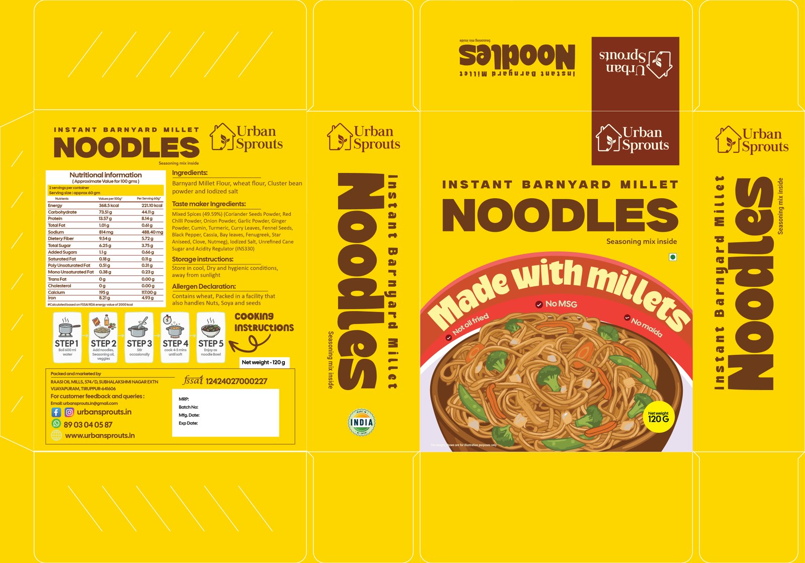
A warm yellow pack that makes the millet noodle name immediately recognizable.
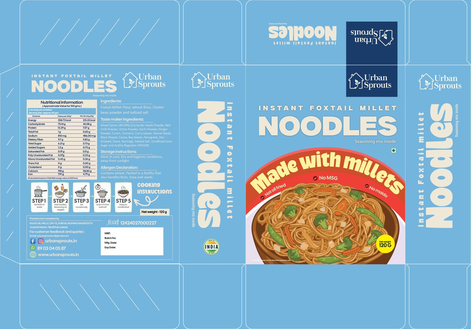
A blue pack with bold white lettering and appetite-led noodle imagery.
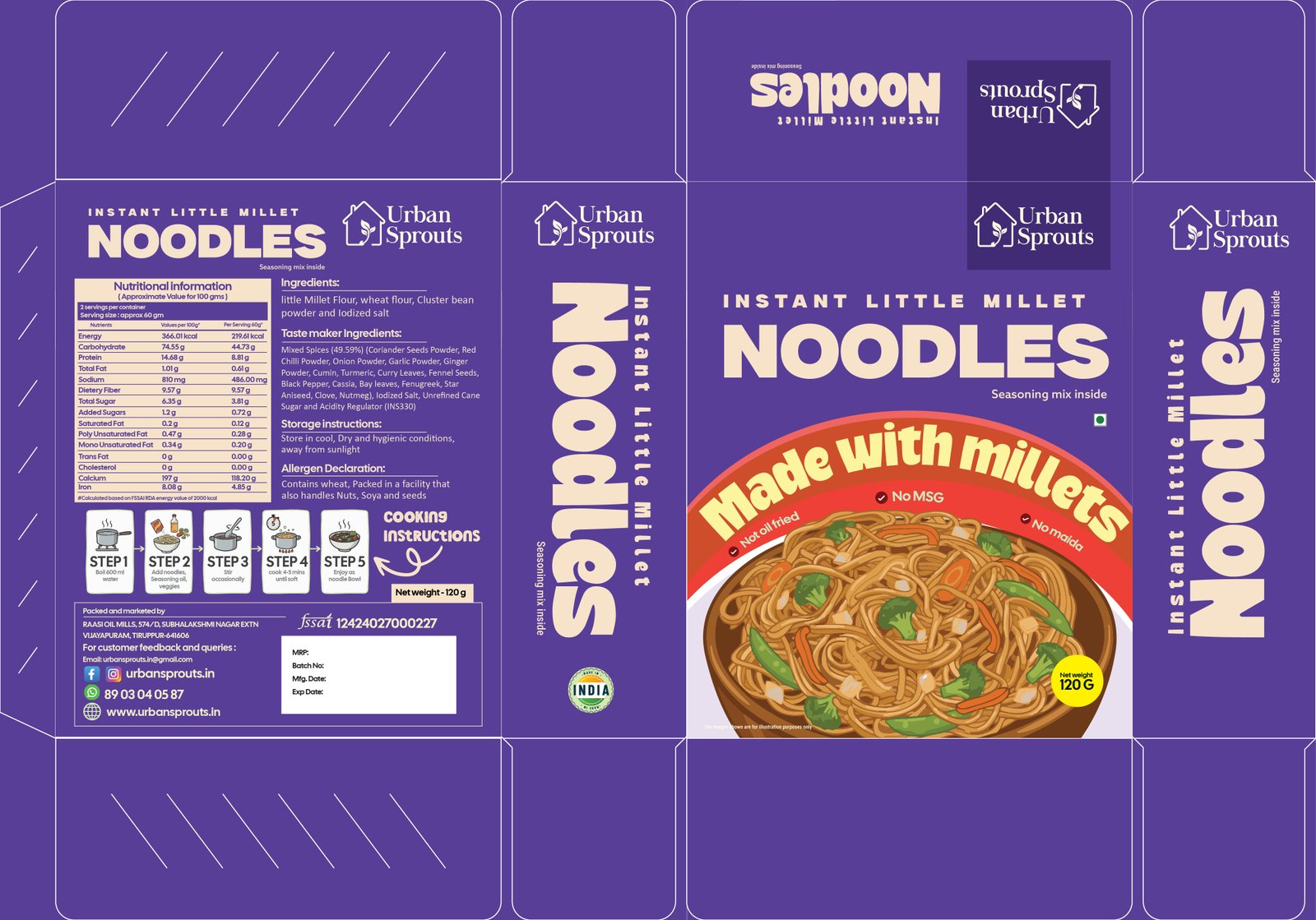
A distinctive violet pack that stays consistent with the core range.
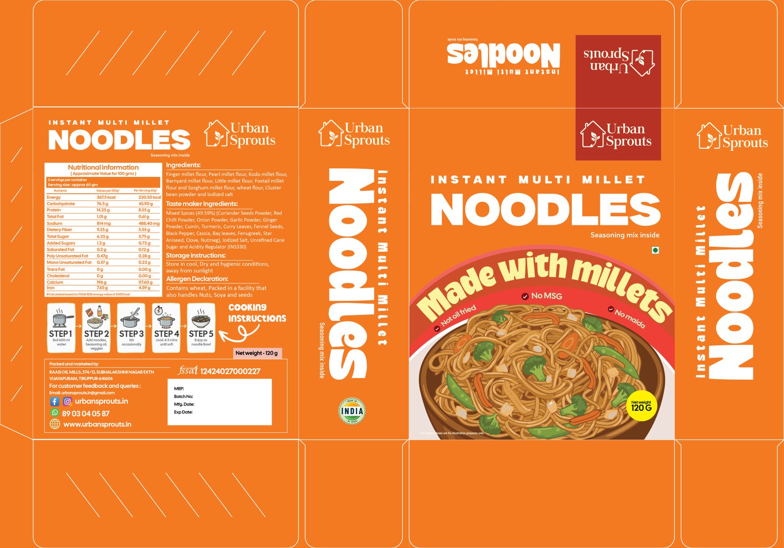
An energetic orange pack that brings multiple millet ingredients under one visual system.
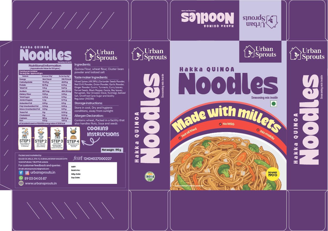
A contemporary purple design that fits the Hakka noodle sub-range.
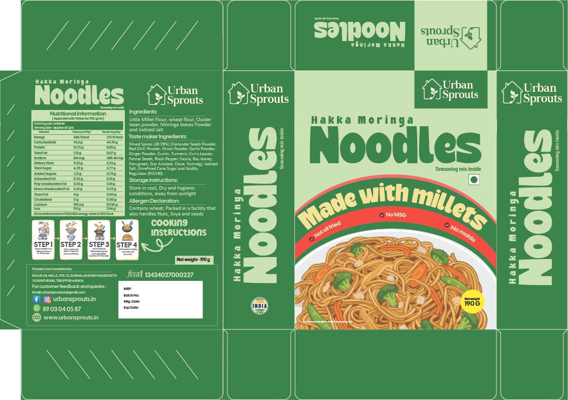
A botanical green palette that makes the ingredient variety easy to identify.
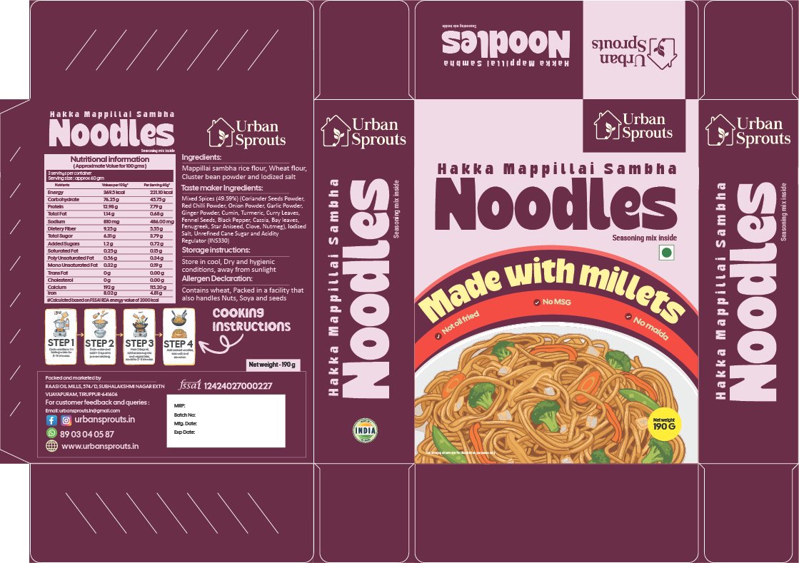
A rich berry-coloured look that connects the grain story with modern retail design.
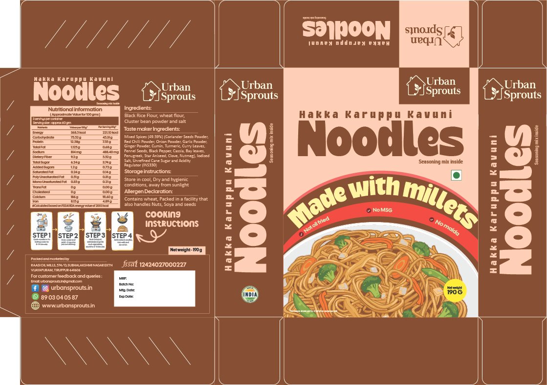
A grounded dark palette supporting a distinctive black-rice noodle variation.
The Urban Sprouts brand connects traditional grains and ingredient-led food choices with the convenience of instant noodles. Big Box Studio’s packaging design approach was to make that proposition easy to understand at a glance: a prominent product name, a familiar prepared-noodle visual, clear variant cues and a consistent carton structure across eight packs.
The scope of this Urban Sprouts packaging project covers how the brand is positioned, how the carton design communicates the noodle product and how colour, typography and layout work together across the full range.
Position the noodles range around familiar ingredients, convenient meal preparation and contemporary everyday appeal.
Create a bold front-panel hierarchy supported by consistent side, top and back-panel artwork for the eight noodle cartons.
Use individual pack colours to distinguish Barnyard, Foxtail, Little, Multi Millet, Quinoa, Moringa, Mappillai Sambha and Karuppu Kavuni.
Make the Urban Sprouts identity, noodle category, variety name and prepared-food imagery easy to scan across pack faces.
Eight individual packs. One unmistakable packaging family.
URBAN SPROUTS / BIG BOX STUDIOThe Urban Sprouts packaging colour system gives every variant a distinct visual cue while preserving the same logo placement, noodle typography and carton architecture. Explore each of the eight colour directions to see the palette references and design inspirations used in this case-study presentation.
The intended design impact is clearer category communication, more consistent recognition across eight SKUs and stronger differentiation on a crowded food shelf. These are design outcomes, not measured sales or conversion claims.
A repeatable visual system helps shoppers connect all eight noodle boxes to the Urban Sprouts brand.
Each SKU receives a clear colour identity, helping shoppers tell one noodle variant from another.
Shared type, imagery and panel layout create consistency between the millet and Hakka noodle ranges.
Design impact is described qualitatively; no unverified sales figures or performance metrics are implied.
A quick overview of the branding, packaging and visual system featured in this case study.
The showcased work centres on packaging design and brand positioning for Urban Sprouts’ instant noodle range, with a shared carton layout, strong product typography, ingredient-focused imagery and colour-coded variants.
The case study includes eight packages: Instant Barnyard Millet, Instant Foxtail Millet, Instant Little Millet, Instant Multi Millet, Hakka Quinoa, Hakka Moringa, Mappillai Sambha and Karuppu Kavuni noodles.
Each pack has its own prominent colour, while Urban Sprouts branding, noodle naming and panel composition remain consistent across the family. This allows quick variant comparison without losing brand recognition.
The design approach is intended to make the product easy to recognise, communicate its noodle variety clearly and give the full range a cohesive FMCG shelf presence. The case study does not claim verified changes in sales or traffic.
Looking for FMCG packaging design, a stronger brand identity or clear product positioning? Explore our other branding projects or discuss your next packaging brief with Big Box Studio.
Discuss packaging design